Problem Statement
Develop a dedicated page to empower traders by showcasing opportunities in the options market effectively. This page should provide advanced tools and insights for analyzing options market data, enabling informed decision-making and enhancing trading strategies
Objective of the project
Our objective was to enhance the engagement of options traders on the platform. After conducting thorough research, we identified the need for an options analysis tool to support traders in evaluating and identifying potential trade opportunities more effectively.
Goal & Solution
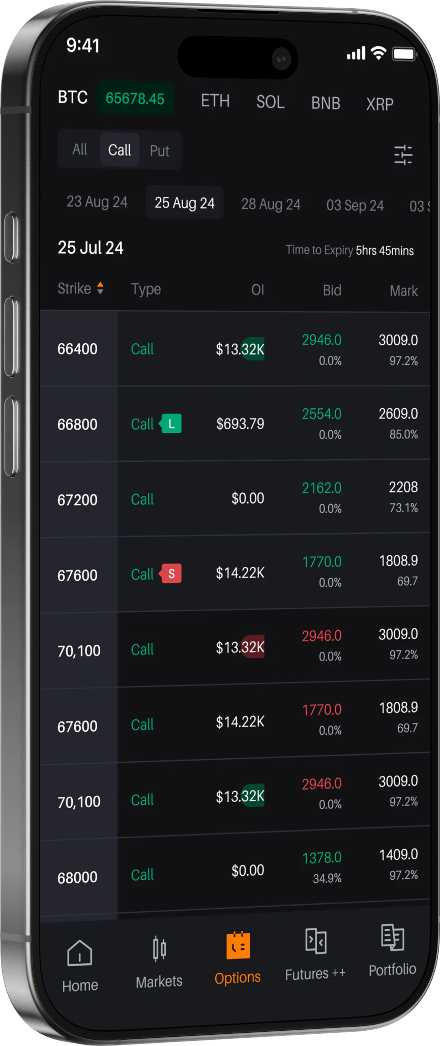
We developed an analytics platform specifically designed for options traders, named Options Analytics. This platform provides actionable insights that empower traders to make more informed decisions by identifying and evaluating trade opportunities with greater efficiency. - The option analytics page on Delta Exchange offers a summary or generalized review of the different metrics to analyse the options market. - The insights from this page provide a snapshot of market sentiment, liquidity, and potential price movements. - The information available on this page serves as a compass, guiding traders to make informed choices and optimize their strategies.
Design Actions
With our research and insights established, the next step was to translate these findings into visual and UI designs. In creating a technical analysis tool, our goal was to present complex data in an interactive and intuitive way, enabling traders to effectively identify and analyze trading opportunities through graphical representations. To achieve this, we organized and categorized the graphs to be represented as follows
1 - Open Interest
The Open Interest chart displays the total number of outstanding option contracts across various strike prices. Selecting multiple maturities simultaneously adds up the open interest for each selected expiry on the particular strike.
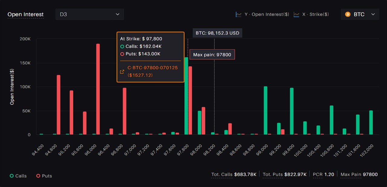
When a strike price shows high open interest levels, it may suggest that traders and investors are anticipating potential price movements in the underlying asset. Conversely, low open interest levels may indicate a lack of market interest or confidence in the asset's direction at that particular strike price.
In the case of call options, high open interest levels are often treated as resistance, while these levels for put options are regarded as support.
The Open Interest chart displays the total number of outstanding option contracts across various strike prices. Selecting multiple maturities simultaneously adds up the open interest for each selected expiry on the particular strike.
2 - Open Interest Change
The Open Interest Change chart displays the changes in the total number of outstanding Call and Put options contracts across various strike prices. Users can select multiple expiration dates to see the cumulative changes over a specific time period.
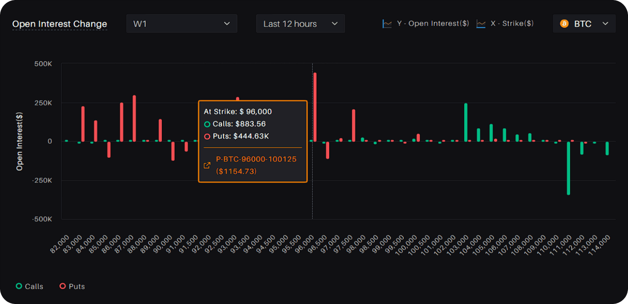
If the open interest at the strike with the highest open interest decreases while the market is going up, the supposed resistance level may become obsolete. The decrease in open interest at a particular strike could be a sign of depleting confidence of call writers in the market resistance at that strike.
Traders can use this chart to identify potential trends and changes in market sentiment that may inform their trading decisions.
3 - Volume vs Strike
The Volume vs. Strike chart displays the 24-hour trading volume for call and put options across various strike prices.
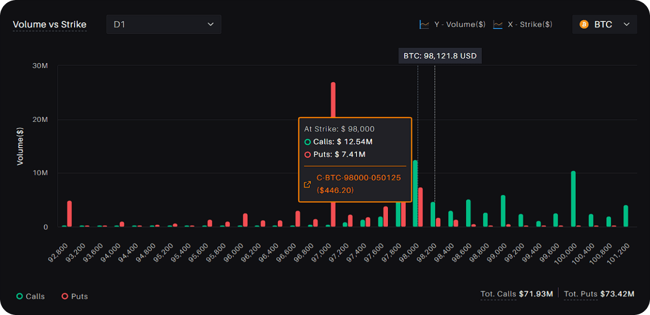
Understanding the volume distribution across different strikes can provide insights into the market's consensus on the most likely price range for the underlying asset.
Traders can use this chart to identify the most actively traded strike prices for a particular maturity.
4 - Implied Volatility
This graph represents the implied volatility values for options across a range of strike prices with the same expiration date.
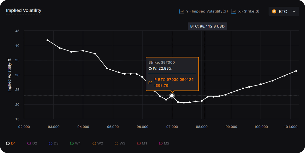
In many cases, this graph shows a skew or smile shape, where the implied volatility values for options that are further out of the money are higher than for options at the strike price closer to the underlying instrument's price. This is why it is also called “Volatility Skew.”
This is often the case because out-of-the-money options are more sensitive to changes in the underlying asset's price, which means that they are typically more volatile and, therefore, command a higher implied volatility premium.
Traders and investors can use the volatility skew to gain insights into the market's expectations of future price movements for the underlying asset and identify potential trading opportunities, such as buying or selling options, using spreads, or making directional trades.
5 - Implied Volatility(IV) vs. Realized Volatility(RV)
The Implied Volatility vs. Realized Volatility graph plots the implied volatility of an option contract against the realized volatility of the underlying asset over a specific period. Implied volatility is the market's expectation of how much the price of the underlying asset will fluctuate in the future, whereas realized volatility is the actual historical volatility of the underlying asset over a given period.
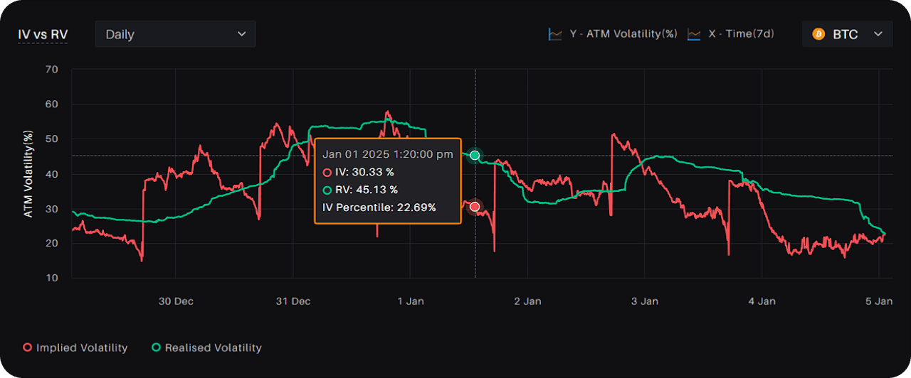
Traders and investors can use the Implied Volatility vs. Realized Volatility graph to identify potential trading opportunities, such as buying or selling options, depending on their market outlook and risk tolerance.
For example, if the realized volatility is consistently higher than the implied volatility, traders may consider buying options to take advantage of potential price movements, while if the realized volatility is consistently lower than the implied volatility, traders may consider selling options to generate income from the premiums.
6 - Implied Volatility(IV) - Realized Volatility(RV)
The Difference of Implied and Realized Volatility graph plots the difference between implied and realized volatility of the underlying asset over a specific period. It can be used with IV vs. RV graph to gauge the rarity of the opportunity in the market. 1 SD line represents one standard deviation of the difference graph.
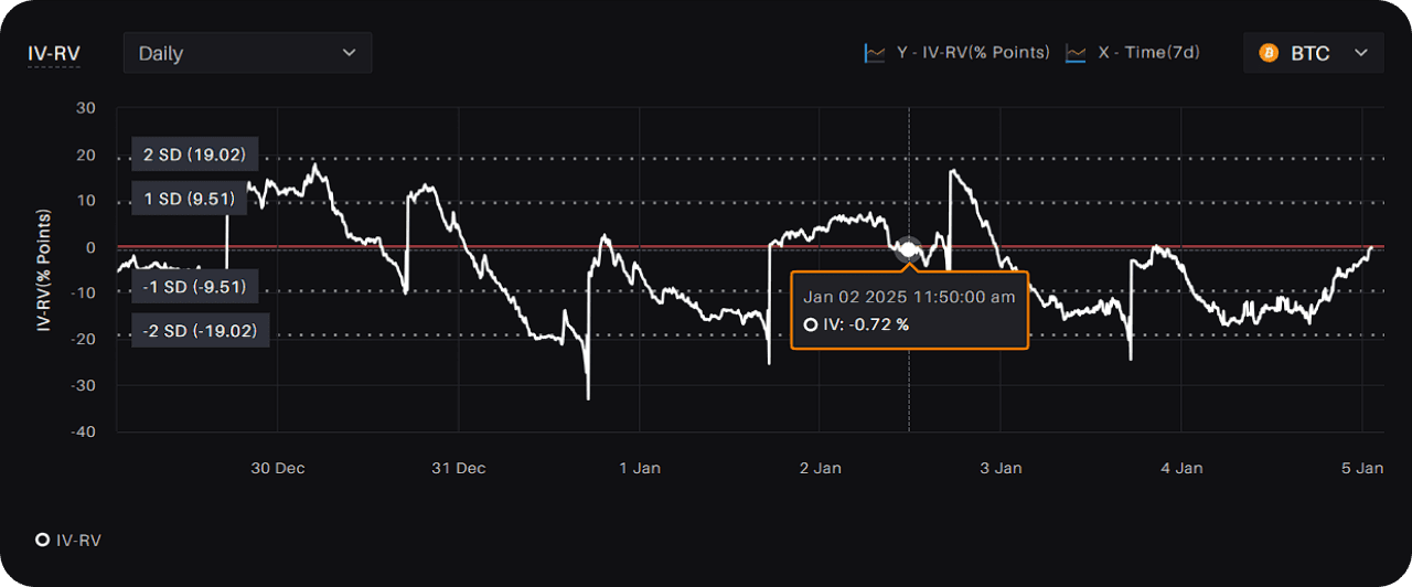
normally distributed sample, 68% of the points lie between +1 SD and - 1 SD from the mean and 95% between +2 SD and -2 SD from the mean.
If the trader expects the realized volatility to be lower than the implied volatility, they will sell the straddle and vice versa.
Traders can capitalize on such opportunities by trading straddles (Move contracts on Delta Exchange).
7 - Taker Activity
The Taker Flow Chart displays real-time taker activity in the options market. Takers are market participants who take an existing order off the order book.
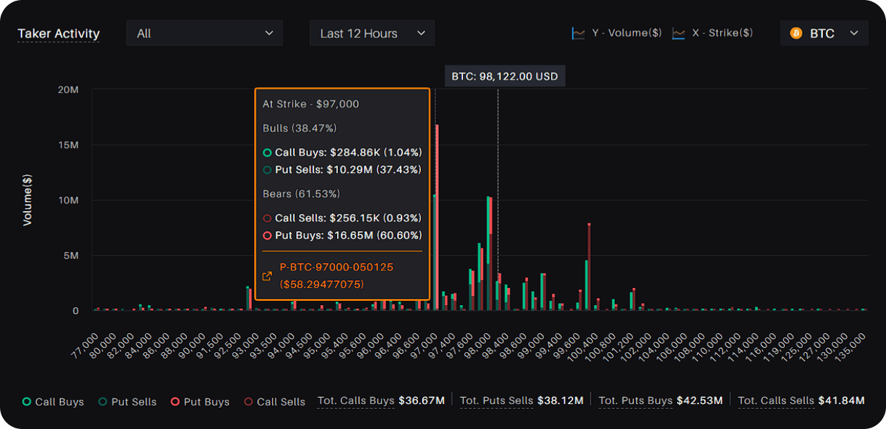
The chart shows bearish and bullish activity in the options market through red and green bars, respectively. The red bars represent activity in call sells and put buys, while the green bars represent activity in put sells and call buys.
The chart can also be used to contrast the taker's view with the maker's view. Makers are market participants who provide liquidity by placing orders on the order book. By comparing the taker’s activity with the maker's, traders can gain insights into the supply and demand dynamics of the options market and make more informed trading decisions.