💡 A Platform Built for Everyone, Yet Not Working for Many
As the team’s product designer, I sat down on a monday staring at the dashboard. The numbers were merciless.
🔻 KYC completion rate: 41%
🛟 First-time deposit success: 18%
🗿 Bank addition completion rate: 25%
📉 User trust sentiment: very low
📈 Onboarding drop-off: painfully high
Meanwhile, the Indian crypto market was heating up. Competitors like Binance and Bybit were pushing fast KYC funnels. Yet here we were—an India specific exchange boasting institutional-grade derivatives, but losing retail traders in the first ten minutes, We were lacking something crucial yet fundamental.
A 24-year-old beginner trader, captured the sentiment perfectly in his feedback:
❝ Bhai, I was ready to trade. But your KYC is too long, bank addition is confusing, and I honestly didn’t know what step comes next. ❞
A professional options trader, echoed a deeper frustration:
❝ I don’t need hand-holding, I need speed. Your onboarding makes me feel stuck. ❞
I knew that until & unless onboarding was fixed, nothing else mattered—no product update, no new futures or options contract, no marketing campaign.
This case study is the story of how we rebuilt onboarding from scratch—shorter, clearer, compliant, trustworthy, and conversion-focused.
⚜️ THE PROBLEM LANDSCAPE
🎯 Problem 1 — High Dropout & Low Conversion
All problems pointed to one outcome: Users abandoned onboarding before completing even step 2.
This was costing:
New signups
Brand reputation
First-time deposits
Growth momentum
Daily-trading volume
It was clear: 👎 Onboarding was a business bottleneck.
✨ Solution 1 — Fluid Signup and onboarding process
Along with Email sign-in/signup we also Integrated Google Identity Services (GIS) sign-in/signup feature ("Sign in with Google" or "One Tap") for a secure and streamlined onboarding
🎯 Problem 2 — No Progress Indicator after onboarding. Users Felt Lost.
Earlier, the onboarding flow relied solely on CTA text:
But there was no progress tracking UI, no visual milestone, no sense of “how far I’ve come.” Users felt like they were falling into a never-ending funnel.
Symptoms:
😵💫 Confusion
🪜 Perception of “long process”
🫠 Anxiety about compliance
🐾 Higher drop-offs at each micro-step
Even Aman expressed: “If I knew I’m 50% done, I’d continue. But it felt like there’s more and more.”
✨ Solution 2 — Introducing a 3-Step Visual Progress Indicator We redesigned the entire home screen for new users.
The indicator included:
Complete KYC
Add bank details
Add funds
Each step lit up as users progressed.
Why this worked:
Clear expectation → reduced anxiety
Psychological momentum → higher completion
Visual progress → increased motivation
This alone reduced drop-offs by ~19% in the first week.
🎯 Problem 3 — Tedious KYC, Bank Addition & Deposit Flows
The UX audit exposed the brutal truths:
KYC issues:
⽥ Too many fields upfront
🫥 No real-time validation
🏋 Heavy document uploading
⏳ Manual approval delays
🆘 OCR failures
Bank addition issues:
Users needed to enter account numbers manually
Any mismatch meant a complete restart
Verification took time
No penny-drop automation
Adding funds issues:
No UPI integration
Clumsy UI
Only bank transfers
Users dropped out when asked to switch apps
Industry benchmark: 85% of Indian retail traders prefer UPI for deposits under ₹10,000. We weren’t supporting the #1 behaviour of the market.
✨ Solution 3a — Fully Optimised & Shortened KYC Flow KYC went through an entire structural overhaul.
Key Improvements:
A. Smart Auto-Fill PAN & Aadhaar data auto-filled via digilocker APIs.
B. Real-Time Validation
Name mismatch
Address mismatch
Document clarity
Face match & liveness
C. 60% fewer fields only show necessary input at each micro-step.
D. Automated Liveness Check AI-powered “blink and rotate” liveness allowed frictionless identity verification.
Result: KYC completion time reduced from 4.5 minutes → 1.3 minutes.
✨ Solution 3b — Bank Addition Optimised with Penny Drop & Reverse Penny Drop what used to happen:
Users manually typed: account number → IFSC → name → bank branch → confirm. A nightmare.
What happens now:
User enters account number → We penny-drop ₹1 → bank confirms
Name
IFSC
Branch
OR
Reverse penny drop → Users make a UPI payment to Delta's bank accounts → We fetch Bank Account Number, IFSC, UPI ID, User Name → We reverse the payment made to user’s account.
UX Improvements:
Zero manual entry
No document upload
No retry loops
95% auto-verification success
Result: Bank addition completion increased by 34%.
✨ Solution 3c — UPI-Based Instant Deposit Flow
We integrated:
UPI Payment
Bank Transfers
UPI Limit - Up to 1L
Bank Transfer - No Limit
UX Enhancements:
Minimal taps
Retry mechanism for failures
Auto-fill amount presets
Real-time success callback
Secure VPA mapping for fraud protection
Result:
First-time deposit success soared to 67%
Overall FTD (First-Time Deposit) conversion up by 52%
🎯 Problem 4 — Low Trust, High Anxiety
Crypto + India = A market where trust is the single biggest currency.
Users were asking:
“Is my data safe?”
“Why so many steps?”
“Is this platform registered with FIU?”
“Is this exchange legit?”
“Why do I have to add my bank first?”
The absence of visible trust markers amplified fear.
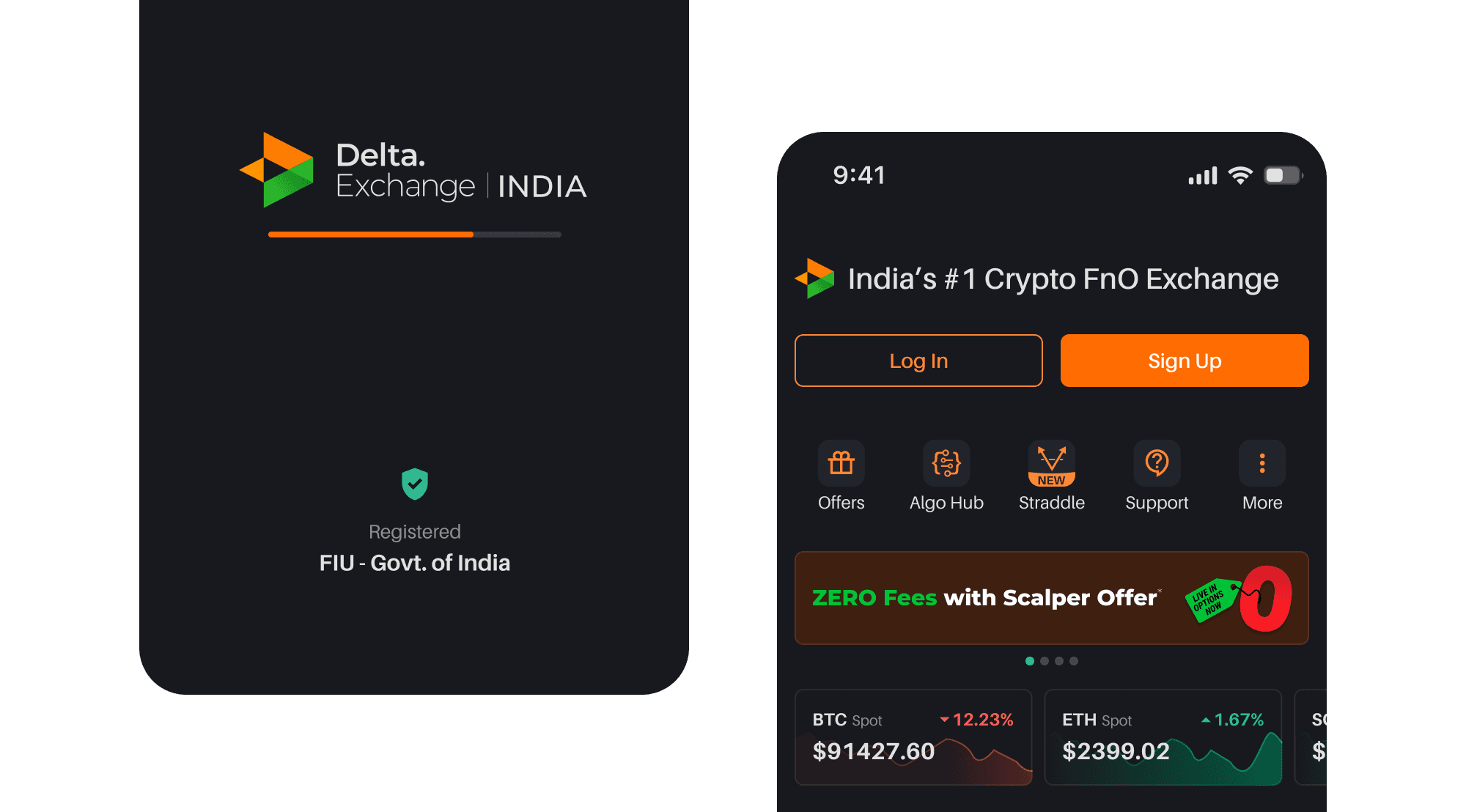
✨ Solution 4 — Trust Layer Added with FIU Registration Highlight Crypto is trust-first.
We strategically added:
FIU-RC Registration Badge
“Bank account used only for withdrawals” statement
“Your data is encrypted & never shared” microcopy
RBI/SEBI-compliant language for KYC
Security seals
A user said: “I continued KYC because I saw FIU. Before that I wasn’t sure.”
Trust went from an assumption to a feature.
⚜️ AFTERMATH: IMPACT & MEASURES
The redesign wasn’t cosmetic. It was transformational.
📈 Quantitative Metrics
🚀 KYC completion: 41% → 78%
💰 First deposit success: 18% → 67%
🙌 Day-1 activation: up by 44%
🏦 Bank addition completion: 25% → 59%
📉 Onboarding drop-off: down by 38%
🦋 User trust sentiment: increased by 35%
📌 Business Impacts
⚡️ Faster funnel → more active accounts
🤝 Better onboarding → higher long-term retention
💸 More deposits → higher trading exposure
🇮🇳 FIU trust → higher credibility in India
📌 Experience Impacts
New Users: felt confident & guided
Seasoned Traders : felt speed & efficiency
Design Team : felt clarity in the product story
Compliance Team: felt compliance without friction
⚜️ KEY LEARNINGS
The redesign wasn’t cosmetic. It was transformational.
Progress indicators drastically reduce uncertainty.
Automation is the strongest UX.
Trust-building must start on step 0, not step 5.
Short flows = Higher dopamine = Higher conversions.
India = UPI first. Build for behavior, not assumptions.
Compliance does not need to ruin the experience.
Microcopy is a conversion tool, not decoration.