Last Edited:
Dec 19, 2024
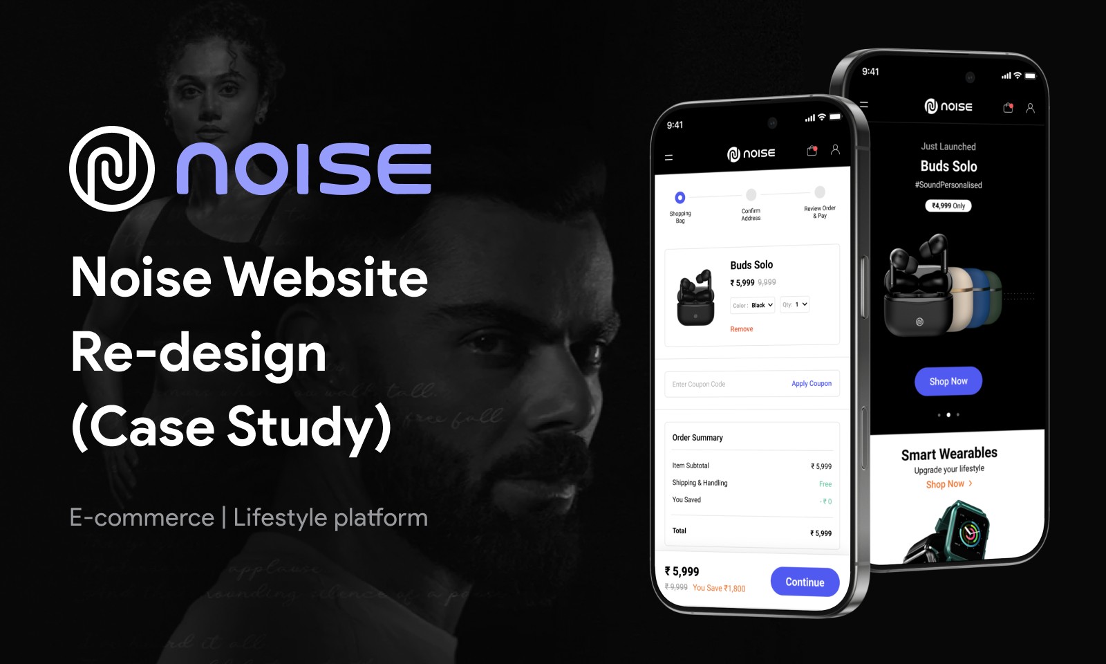
A little about Noise
Noise is a lifestyle brand based in Gurgaon, India. Noise was founded with the mission to democratize connected lifestyle for Indians. They deliver industry-leading products in audio and wearable category and has recently been announced as “ India’s No.1 Smartwatch Brand “.
At the time of writing this case study, the website is up and live. 🔥🙌🏻
Go and check it out ❤️ : https://gonoise.com
About the project
My objective as a UI/UX Designer here in Noise was to re-design their whole website which acted as a main touch point for it’s users. They were expanding their business and new products were being added to the catalogue everyday. Even the logo was re-designed to better portray them to the world, but this was done by an external designer.
The scope of the project was to design and implement a new design system across the website to provide consistency and ease-of-use to the customers. Their were around 15-20 pages which included sections like, Landing Page, Product Collections, Cart, Order Pages, User Account Pages, About, TnC, etc.
Problem
Despite being a page with great Page rank, thousands of monthly visits and high product purchase rate, the company website had a very low conversion rate on their in-house e-commerce website. The reason was that most of the purchases were happening on large e-retail/commerce giants like Amazon, Flipkart, etc.
Goal
How might we improve the user’s experience, so that we attract new users and the conversion rates increase.
Solution
To re-design the whole platform from ground-up using new design principles and enhance the overall experience of the website.
Competitive Analysis
Before initiating any project, my first priority is to thoroughly understand the project's scope. This involves engaging in detailed discussions with the design team and key stakeholders to clearly identify objectives, expectations, and specific requirements. This collaborative approach ensures alignment and sets a strong foundation for the design process.
Once the project scope is defined, I conduct a comprehensive competitive analysis to explore existing design paradigms. This analysis focuses on critical aspects such as content hierarchy, navigational flow, and essential website components like contact information, footers, and interactive elements.
The primary advantage of performing a competitive analysis lies in the strategic application of Jakob's Law, a fundamental UX principle which states: "Users spend most of their time on other sites. This means that users prefer your site to work the same way as all the other sites they already know." By understanding common user expectations shaped by familiar interfaces, I can design more intuitive and user-friendly experiences.
My process typically involves collecting and reviewing screenshots of competitor websites to analyze design patterns, usability, and functionality. This methodical evaluation provides valuable insights into industry standards and user behaviors.🙌🏻

Key takeaway from competitive analysis
Users expect the shopping cart to be positioned at the top-right corner of the page.
The Account and Cart sections should be placed in close proximity to facilitate quick access.
The search function must be prominently displayed at the top of the page for visibility.
Product categories should be easily accessible and visible on the homepage for efficient navigation.
Navigation menus should remain consistent and accessible across all pages of the website or platform.
Call-to-Action (CTA) buttons should be clear, concise, and provide immediate feedback to users.
Product images should be high-quality and offer zoom-in functionality for detailed viewing.
Loading speeds must be optimized to minimize user drop-off and improve overall engagement.
Breadcrumb navigation should be incorporated to enhance user orientation and ease of navigation.
Responsive design is essential to ensure seamless usability across various devices and screen sizes.
User reviews and ratings should be prominently displayed to build trust and influence purchasing decisions.
This structured approach to competitive analysis ensures that design decisions are user-centered and aligned with industry best practices, ultimately leading to more effective and engaging user experiences.
Qualitative Analysis
As a part of qualitative research I conducted 1-1 interviews with some of my peers who usually purchase products similar to Noise’s portfolio. It was not a personal interview due to covid situations and was conducted through phone call. The number of people interviewed was also not that big, again due to covid and limited time frame. 😷
Questions :
How frequently do you use an e-commerce platform/website ?
How do you decide which product to buy ?
Do you look for customer reviews/ratings ?
What’s your flow while purchasing a product ?
Desired method of payment ?
When do you track order ?
How frequently do you track order ?
........ and so on
At the end of the interview, I also asked the audience to have a run through Noise’s old website to better understand the pain points and get a deep understanding of the problem.
Conclusions 👀
Comprehensive UI/UX Analysis and Redesign:
Research Insights: Through extensive research, I identified critical flaws in the platform's user interface (UI) and user experience (UX) that negatively impacted user engagement and satisfaction.
User Interface (UI) Challenges:
The website followed an outdated UI language, resulting in a dated and unappealing design.
Elements were overly congested, creating a cluttered appearance that resembled spam content.
Disjointed and abrupt user flows disrupted the overall platform experience.
Specific Issues Identified:
The cart redirected users directly to the checkout page without allowing them to review items while browsing.
Misaligned call-to-action (CTA) buttons and UI components caused inconsistency.
The website lacked a proper grid system, leading to poor layout alignment.
Absence of visual hierarchy made navigation difficult and disorienting.
Inconsistent UI design across different sections.
Predominantly black-and-white UI, except for promotional banners, resulting in a monotonous visual experience.
User Experience (UX) Challenges:
The platform offered a limited and basic shopping experience, prompting users to switch to competitor sites.
Standard checkout flows were insufficient to provide a seamless experience, contributing to low conversion rates.
Research findings revealed:
Product Reviews: 80% of users preferred to check product reviews before purchasing, but no review system was available.
Order Tracking: Users could not track orders within the platform and had to rely on slow third-party services.
Address Management: Users were limited to a single delivery address with no option to add or manage multiple addresses.
Information Architecture: The core information structure was well-organized, with clear distinctions between product categories and user actions.
Product Comparison: The absence of a comparison feature prevented users from evaluating products side by side.
Strategic Improvements Implemented:
UI Overhaul: Modernized the interface with a clean, consistent design and proper grid alignment to enhance usability.
Enhanced Cart Functionality: Allowed users to view and edit their cart without interrupting product browsing.
Streamlined Navigation: Introduced clear CTAs and intuitive user flows for seamless interaction.
Integrated Product Reviews: Added a product review and rating system to assist users in informed decision-making.
Built-in Order Tracking: Developed an in-platform order tracking system for real-time updates.
Flexible Address Management: Enabled users to add and manage multiple delivery addresses for greater convenience.
Product Comparison Tool: Introduced a feature to compare products, helping users make well-informed purchasing decisions.
These UI/UX enhancements have collectively improved user satisfaction, streamlined the shopping experience, and significantly boosted conversion rates.
Design System & Style Guide

High-Fidelity Wireframing
Now we come to next step in the story. The UI or User Interface designing phase. I personally love this step as I can let everything flow. I love making aesthetic experiences which can ease the life of end user.
Landing Page
This page needed a massive visual upgrade. All sections consisted of some kind of marketing banner and were not following and visual hierarchy. You don’t need to be a designer to figure that out. But still let me take you through with some other changes.

Collection/Categories UI
Product Categories Enhancement: The Collections or Product Categories section is the most crucial part of the website after the landing page. As the backbone of an e-commerce platform, it simplifies and accelerates product search, directly impacting the overall shopping and checkout experience. An effective categories section can significantly influence user engagement and conversion rates.
Categories, as collections of items sharing common characteristics, have been integral to human decision-making since ancient times. They help users navigate complex information effortlessly, making online shopping more straightforward and efficient.😌
Previous Challenges:😡
The previous implementation of product collections was structurally sound in terms of information architecture but lacked visual appeal.
This absence of aesthetic design led to user confusion and frustration, diminishing the effectiveness of the shopping experience.
According to the Aesthetic-Usability Effect, users often perceive aesthetically pleasing designs as more usable. This insight highlights the importance of enhancing visual design to improve usability.

Implemented Improvements:
Visual Revamp: Redesigned the product categories section with a focus on modern, engaging, and intuitive visuals to guide users seamlessly through product discovery.
User-Centric Navigation: Introduced clear categorization and easy-to-use filters, ensuring users can find products efficiently.
Enhanced Visual Hierarchy: Applied design principles that prioritize important content and minimize cognitive load, reducing user frustration.
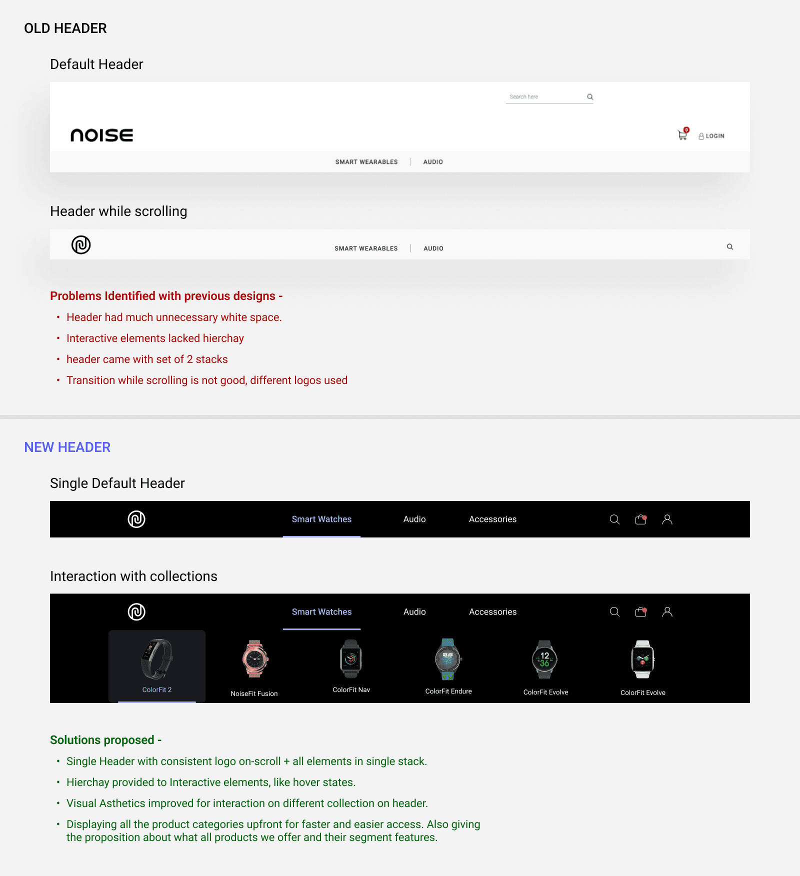
Let’s compare the top navigation bar.
Old Header:
As you can see in the old UI the search is not aligned properly with other components, thus giving unfinished and unpleasant look. ❌
User looses access to cart and account section on scroll. ❌
New Header :
Flat and minimal navigation bar with inline CTAs and proper user feedback. ✅


By addressing design shortcomings and focusing on user pain points, the revamped categories section now offers an aesthetically pleasing and highly functional experience. This transformation has led to smoother navigation, higher user satisfaction, and improved conversion rates.

User Account Management Enhancement
User account management is a critical component in the e-commerce life cycle, providing transparency and convenience by enabling users to manage product and checkout-related information seamlessly.
Previous Challenges:
The platform lacked a structured account management flow. Users were required to enter their address details at every checkout, creating friction in the purchasing process.
Order tracking was dependent on third-party services, limiting the platform's ability to provide a cohesive user experience.
The "Manage Orders" section was visually unappealing, presented as a basic Bootstrap page overloaded with information, lacking clarity and engagement.
These inefficiencies led to redundant data input and prolonged user flows, causing users to visit the website solely for information rather than completing purchases. This ultimately resulted in low conversion rates and negatively impacted sales.
Implemented Improvements:
Integrated Cart Functionality: Introduced a dedicated cart system to streamline the shopping and checkout process.
Enhanced Address Management: Enabled users to add and manage multiple delivery addresses, offering greater flexibility.
Simplified Order Tracking: Developed an intuitive order tracking system within the platform, eliminating the need for third-party services.
Redesigned Manage Orders Section: Transformed the "Manage Orders" page into a visually engaging and user-friendly interface with detailed order information.
Optimized Login Experience: Revamped the login screens to ensure faster and more seamless user access.

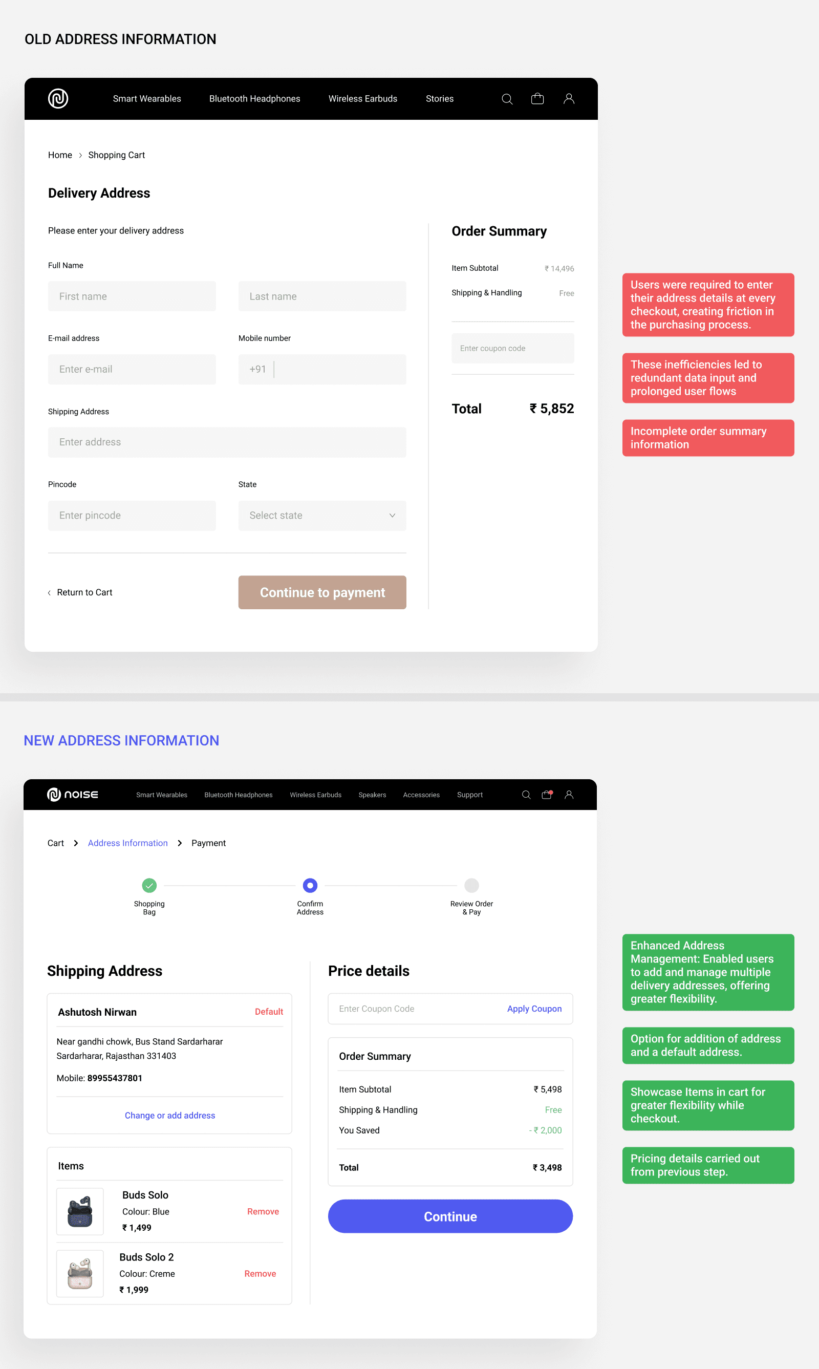
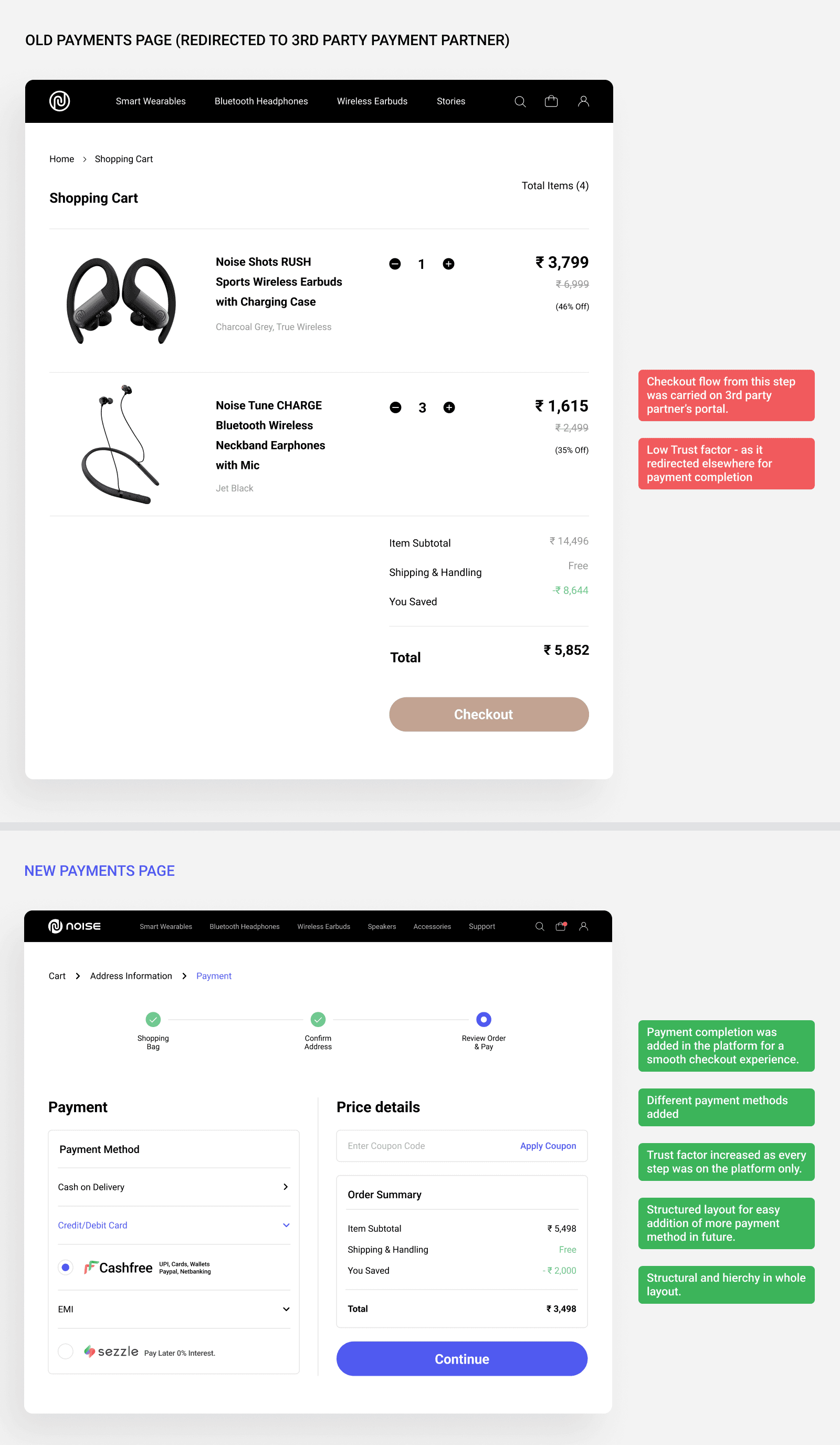
These strategic updates have significantly improved the overall user experience, making the checkout flow more intuitive and user-friendly. By addressing previous pain points and aligning with standard e-commerce expectations, these enhancements have contributed to increased user engagement and higher conversion rates.
Rejections too are a part of life.
I encountered numerous rejections in this section due to the need to prioritize space optimization and improve clarity. A common issue with many of the rejected cards was excessive space consumption when displayed on the platform, resulting in increased scrolling for users to access the same amount of information. Additionally, some designs did not align with the new design system, particularly in adhering to the updated color scheme.

My Closing Thoughts
In conclusion, this project underscores the critical role of user-centered design in the development of a highly intuitive and seamless e-commerce experience. The focus on understanding the needs and behaviors of the target users allowed us to craft an interface that not only meets functional requirements but also anticipates and exceeds user expectations. By prioritizing clarity, accessibility, and efficient navigation, we ensured that the redesigned platform provides users with a smooth and engaging journey from start to finish.
The strategic improvements made to the interface serve not only to enhance user engagement but also to align with and support key business objectives. Streamlining the shopping journey, reducing friction points, and optimizing the layout were instrumental in improving both user satisfaction and operational efficiency. These refinements contribute to a more accessible, enjoyable experience that facilitates easier decision-making, which, in turn, positively impacts conversion rates and overall sales performance.
This case study highlights the power of thoughtful, research-driven design decisions to solve complex usability challenges while achieving tangible business results. The focus on usability improvements and customer-centric features has contributed to a stronger connection between the user and the platform, leading to higher customer satisfaction and repeat engagement.
Looking ahead, the continuous collection and analysis of user feedback will be paramount in maintaining a competitive edge. Iterative design and ongoing enhancements based on real-world user data will ensure the platform remains adaptable to changing needs and expectations, guaranteeing its long-term success and positioning it as a leading, user-friendly e-commerce solution in the market.


